
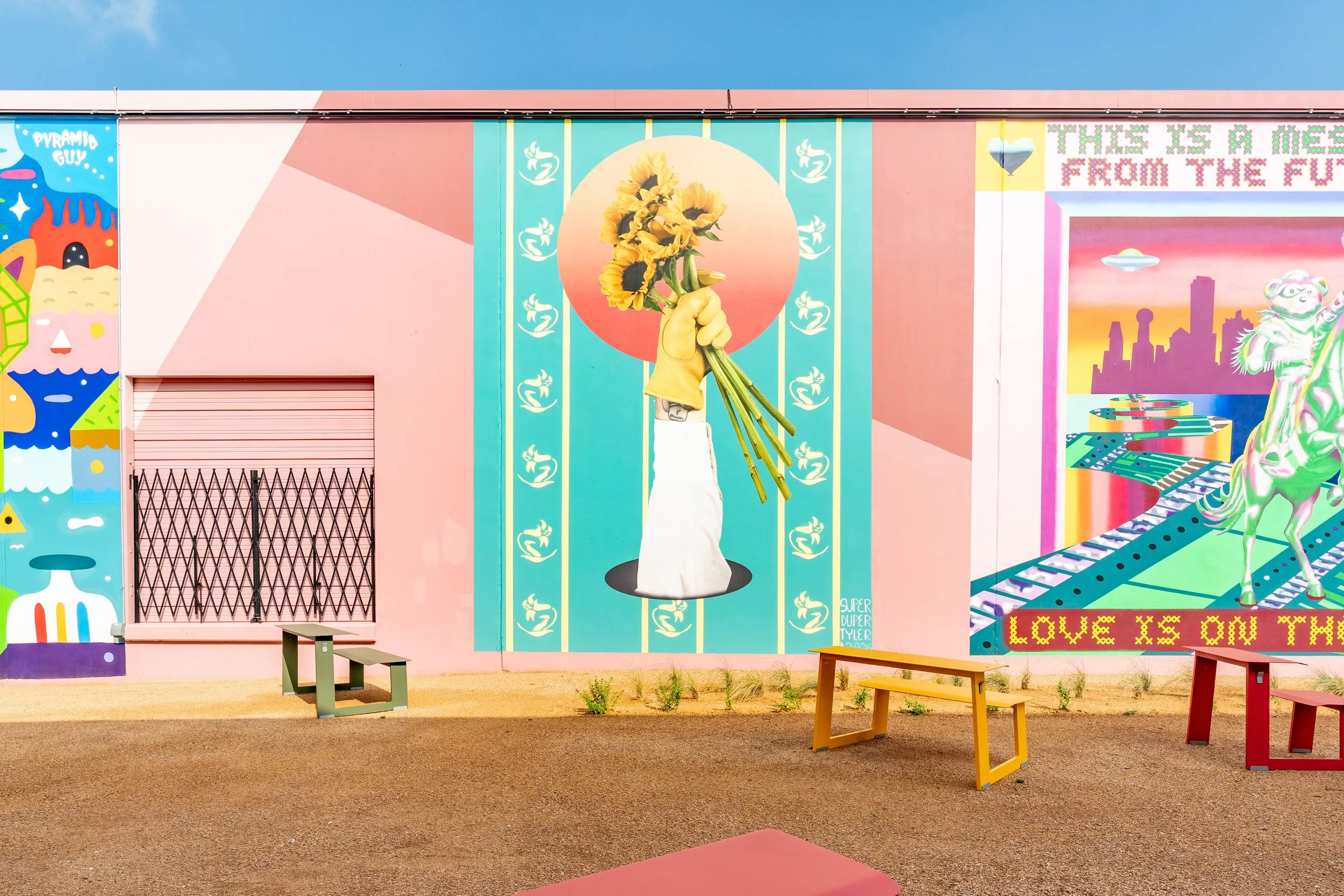
Tyler Germaine
Title: The bison tiptoed while the cow walked
Medium: vinyl on latex and spray paint
Social: @SUPER_DUPER_TYLER
Tyler is a photographer, director, and visual artist based in Dallas-Fort Worth. He has been behind the camera for a decade now, blending technical precision with a bright, creative eye. Tyler specializes in editorial, lifestyle, and product photography and video. “This mural began with the flowers. I’ve been diving deep into nature, specifically nature in North Texas, as a way of connecting more intimately with my roots. The Maximilian sunflowers have always been a particular favorite of mine, so they became the catalyst. Flowers hold a lot of meaning for everyone, but to me, I’ve always loved the contradiction of fragility and toughness they represent. In the South, there’s an idea that we should only show strength, and that’s especially true in cowboy culture, where life has never been easy. I want the flowers to show that without fragility, the fullness of life can never be experienced.”
Behind the mural
-
I come from what I call an observational absurdist background. That might sound like fancy language, but it’s a simple idea: I like to look at things that are often overlooked, and reflect them back toward the audience. As a photographer, that’s the truest form of this medium, we observe, remain distant, and show what we see.
I tend to follow subjects that feel normal or so culturally ingrained that they’ve become almost invisible. But when you take a second and really look at it, you start to see the weirdness and absurdity that comes with it. They’re often strange, contradictory, or even a bit surreal. That tension is what keeps me going as an artist.
I’m also interested in how meaning gets assigned to anything and everything. I’m always in the process of building my own book of symbols from these subject matters I’m particularly drawn to, usually out of everyday objects, things that don’t have a pre-assigned meaning or ones that I can morph the meaning to something more integral to me and those who grew up like me. A lot of these come from the visual landscape of the south, things like billboards, bison, native flowers, front porches, etc. These feel specific and recognizable, but aren’t fixed in what they represent.
Rather than using my work or these symbols to argue a point or deliver a clear message, I’m more interested in creating space for recognition. I usually don’t expect the viewer to arrive at the exact meaning I put into a piece, in fact I try to avoid doing that. Art is a language that plays on each individual's life and context, so I try to leave things open enough that every viewer can put their own life into the symbols. This mural at Art Docs follows that same mindset; it pulls from imagery we all recognize, but asks you to sit with it just for a bit, until you find what it means for you, even if it completely diverges from my own meaning.
-
Public art brings art to everyone. There’s an idea that art is pretentious, that it’s only meant for the highly educated or rich, but it doesn’t have to be. As someone who is neither, I want to show why I care so deeply about making this kind of work, and public art is the perfect avenue for creating this connection.
It also opens our work up to anyone who might be able to relate or appreciate what they see. By placing work in these shared spaces, we get to engage with people who might never step foot into a museum or gallery. That audience matters a lot to us as artists. This is our community, people like us, that’s who we want to engage with the most. I hope when someone walks past my work they find that moment of recognition and connection. They find something familiar, something from their own childhood or a small insight into deeper parts of themselves. That connection, however fleeting, is why public art matters.
-
I start with the symbols I was talking about earlier, taking what I know and finding ways to incorporate them into the final design. For this mural, it began with the flowers. I’ve been diving deep into nature, specifically nature in North Texas, as a way of connecting more intimately with my roots. The Maximilian sunflowers have always been a particular favorite of mine, so they became the catalyst.
Flowers hold a lot of meaning for everyone, but to me, I’ve always loved the contradiction of fragility and toughness they represent. In the South, and even in our broader culture, fragility is almost a bad word. There’s an idea that we should only show strength, and that’s especially true in Southern and cowboy culture, where life has never been easy. I wanted the flowers to show that without fragility, the fullness of life can never be experienced.
After the flowers came the hand and arm of a cowboy, offering them. The cowboy really leans into the contradiction. Cowboys have long been mythologized as tough and stoic, but to have one offer flowers shows the wisdom earned through enduring hardship. We often get caught up in the myth of cowboys and forget they are real people who have experienced real struggles. The Southern folks in my family are often the first to offer gentleness when it’s needed, and I wanted to challenge that myth with this gesture.
You’ll notice the black hole at the base of the arm, along with the floral wallpaper background. I wanted this to represent the interior: the arm has to break through the walls we build up for ourselves in order to be able to even offer the flowers.
Some of the composition was shaped by practical constraints. Originally, I had planned the design to be landscape-oriented. But the wall I was given was vertical. Rather than fighting it, I chose to let the wall guide my design process, leaving the arm upright. That position allows the arm to feel as if it had to work harder to reach its place. I also knew the arm and flowers were going to be a vinyl print, so to make cutting it easier, I added the sun behind the flowers. This not only added compositional weight to the top but also introduced another symbol I love from Texas. It also adds a sense of time, nodding to the idea that it took effort for the flowers to reach the interior.
The colors come from a palette I’ve developed, sourced from some of my favorite films, primarily Technicolor and Kodachrome. I lean nostalgic in my work, so using colors from films of another era helps connect this piece to memory and emotion, both my own and, hopefully, the viewer’s. The palette reinforces the sense of time, place, and feeling that runs through this mural.
-
This project was definitely a new one for me. I came into this project not as a traditional muralist, but as a photographer. I’ve never painted my own mural before, though I’ve assisted on plenty, but I didn’t want to completely change my medium, so I chose to do a vinyl installation of a photograph. Initially, I considered making the entire wall a vinyl print, but due to budget constraints, I decided to take a hybrid approach.
This mural combines paint and vinyl. The floral wallpaper background is painted, while the arm, flowers, sunset, and black hole are vinyl printed, within itself being a mixture of photography and digital design. This allowed me to stay true to the photographic process while collaging different mediums into a single piece, as well as adapting to the scale and realities of this wall.
-
I hope they see me as someone who was never afraid to try new things to tell a story. I hope that, even ten years from now, this mural is still relevant, and communicates something meaningful. I believe that art speaks in a language that words can’t, I just hope that my language continues to resonate over time.
-
It would be “Empty Trainload of Sky” by Gillian Welch and David Rawlings. Rather than being a narrative, this song picks an image to hint at something deeper. The emptiness of a boxcar along with the infinite possibilities that come with being empty. I think that’s the perfect precursor to what this mural says.