
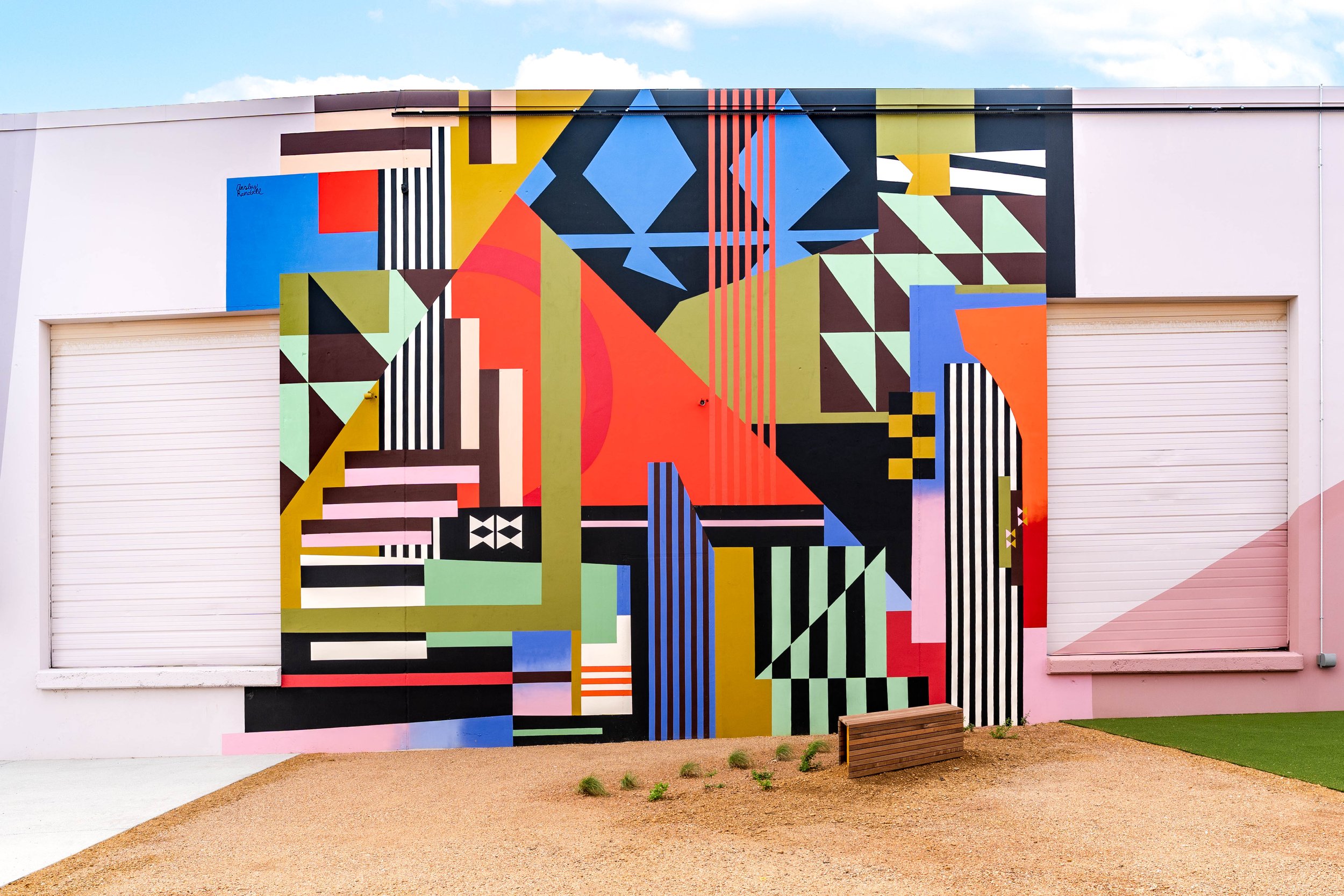
Ansley Randall is an international muralist and artist known for her bold, retro-inspired patterns and vibrant use of color. Drawing from mid-century design, abstraction, and playful compositions, her work transforms spaces into immersive, energetic environments. Ansley’s designs explore the relationship between movement, rhythm, and form. Her intuitive process allows color and shape to take the lead, resulting in dynamic pieces that feel both spontaneous and intentional. “For this mural, I wanted to create something rhythmic and uplifting. The shapes move across the wall in a way that pulls your eye through the composition, while the colors interact with each other to create balance and energy.”
Behind the Mural
-
My work is about how color and pattern can change the feeling of a space. I’m drawn to bold palettes and geometric forms that create movement and energy across a wall. A lot of my inspiration comes from vintage textiles, fashion, and graphic design from the 60s and 70s. It was a time when color combinations felt fearless and expressive.
For this mural at The Art Docks, I wanted to create something rhythmic and uplifting. The shapes move across the wall in a way that pulls your eye through the composition, while the colors interact with each other to create balance and energy.
-
Public art is powerful because it becomes part of everyday life. You do not have to walk into a gallery to experience it. You might just pass it on your way to work or while grabbing coffee.
Murals can transform overlooked spaces and give a neighborhood a sense of identity. I love the idea that someone might walk past this mural every day and slowly develop their own relationship with it.
With this piece, I hope people feel a moment of color and movement that breaks up the routine of the street and makes them look at the space differently.
-
My design process usually starts with collecting visual inspiration. I look at vintage fabrics, old fashion photography, patterns, and color palettes that stand out to me.
From there I sketch compositions that focus on balance and movement. For this mural, I built a geometric composition that guides the eye across the wall while letting the colors interact in a playful way. The palette pulls from retro color combinations but is arranged in a way that feels fresh at a large scale.
Once the design is finalized, I map the shapes onto the wall and build the mural layer by layer until the rhythm of the composition really comes together.
-
This piece was painted primarily with spray paint and exterior masonry coatings. Spray paint allows me to create clean edges, smooth transitions, and large areas of color efficiently, which is important when working at a large scale.
Every mural comes with its own challenges like wall texture, weather, and translating a design from paper to something several stories tall. One of the best moments is stepping back and finally seeing all the shapes and colors working together the way they did in the original concept.
-
Ten years from now, I hope the mural still feels energetic and timeless.
If someone looks at it and wonders about the artist behind it, I would want them to know that my work is about transforming everyday spaces through color. Even a simple wall can become something that brings life to a place and becomes part of the neighborhood.
-
If one song were playing while someone looked at the mural, I would pick “Outa-Space” by Billy Preston. It has that effortless, timeless energy that feels similar to the flow and rhythm of the shapes in the mural.